


Apple has a habit of shaking things up when it comes to how the Mac looks. Remember the shiny Aqua interface back in the early 2000s, or the big shift to flatter, simpler windows with Yosemite? Then came Big Sur in 2020, which made macOS feel a lot closer to iOS, while Sonoma mostly focused on polishing things around the edges.
Now, with macOS Tahoe 26, Apple is rolling out its most significant visual change in years: a new look it’s calling Liquid Glass. The update presents itself as a visual enhancement through its transparent design, rounded corners, and depth effect, which creates a more dynamic desktop experience.
The Legacy of macOS Design
Mac design has progressed through major design transformations instead of making incremental adjustments.
- The operating system OS X received Aqua as its design language when it launched in 2001. The design elements of Aqua created a friendly user interface through its shiny buttons and glassy scroll bars.
- The design of Yosemite (2014) adopted flat, minimalistic elements, which replaced previous textures with simple lines and pale color schemes that followed iOS design principles.
- Big Sur (2020) brought a complete design transformation through its combination of rounded icons, strong colors, and profound transparency effects. The update introduced Apple Silicon technology while creating design unity between macOS, iOS, and iPadOS systems.
- The update to Sonoma (2023) introduced a refined version of the operating system. The update brought enhanced performance and stability to the system while maintaining the Big Sur visual design elements.
Apple demonstrates a recurring design pattern through its development process, which includes extended periods of development followed by complete design transformations. The upcoming 2026 Tahoe release introduces Liquid Glass as its primary design feature, representing the next major design evolution.
What Is the «Liquid Glass» Redesign?
The «Liquid Glass» redesign represents a feature in macOS 2026. The new design language, Liquid Glass, appears in macOS Tahoe 26 as its main feature. The interface redesign through Liquid Glass brings more than visual changes because it transforms the entire Mac user experience throughout daily operations. Key elements include:
- Curved windows. The rounded edges and soft highlights in the design create a polished glass appearance.
- Adaptive translucency. The interface elements change their transparency levels based on the wallpaper or content displayed behind them, which creates a dynamic visual effect.
- Subtle depth. The windows appear three-dimensional through soft, natural shadows, which prevent screen clutter.
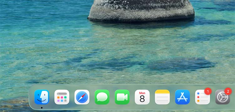
- Refined dock and menus. The floating design of these elements creates a smooth transition between them and the surrounding background.
- Design inspiration. The design takes inspiration from actual glass by using smooth reflective surfaces with an elegant appearance, but maintains a restrained approach to prevent visual distractions.
The design approach of Liquid Glass presents a refined appearance compared to Big Sur’s vibrant design because it introduces the latest macOS design era with a more refined aesthetic.
macOS Tahoe Everyday Usability Changes
Liquid Glass provides users with a complete redesign experience that goes beyond cosmetic changes in the operating system.
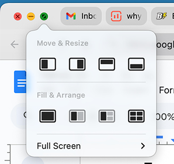
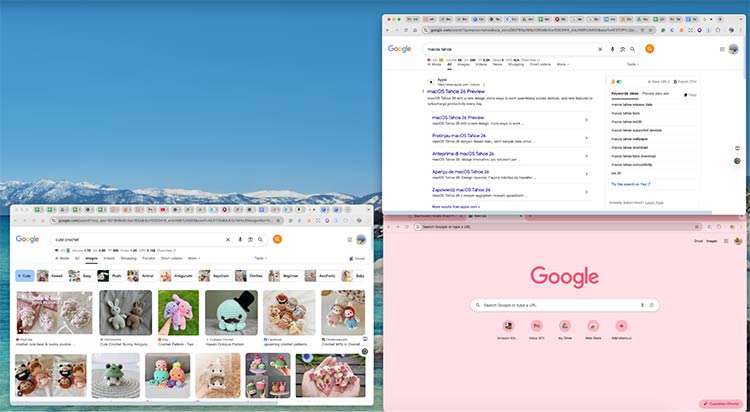
1. Smarter window management
The new rounded window design in macOS Tahoe 26 provides both visual appeal and functional benefits to interface usability. The interface becomes more user-friendly when you begin to move windows throughout the system. The new window splitting feature allows users to divide their screen into two or three sections with enhanced precision and speed. Users who operate multiple applications simultaneously will find these interface updates significantly enhance their multitasking productivity.
2. Menus and toolbars that work harder
The application interface expands because toolbars have become more compact. The soft highlighting effect that appears when you hover over buttons makes it easier to identify clickable elements. The design modification reduces accidental button clicks, allowing users to experience faster navigation through the interface.
3. Dock and mission control improvements
The Dock system maintains its floating appearance while providing better display adaptation when using external monitors because it retains its position instead of moving erratically. The Mission Control interface now organizes windows in a clearer depth order, which reduces the time needed to locate specific windows.
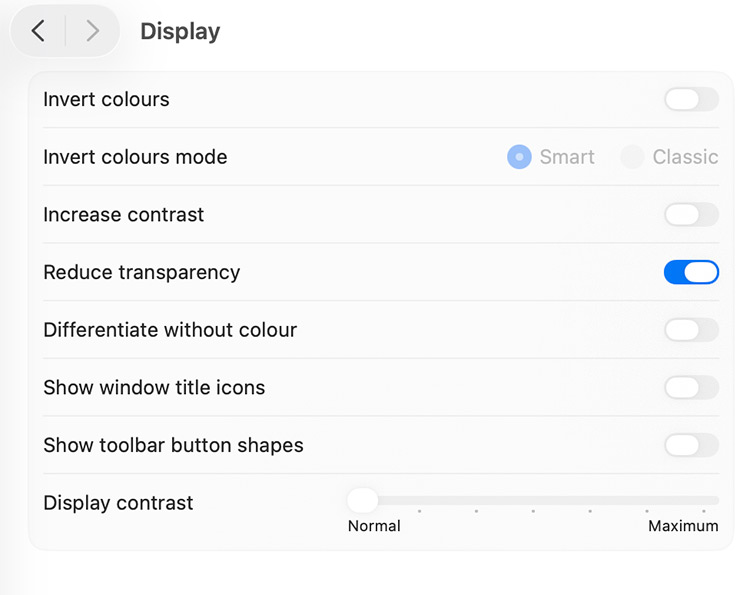
4. Accessibility that feels thoughtful
You can reduce transparency effects, if you want to, to minimal levels without harming the sleek design. The system integrates high-contrast settings more effectively. If you’re one who experiences motion or glare sensitivity, you will find the system more user-friendly because it provides additional customization options.
The system delivers an enhanced daily operation experience because users can perform application switching and window and menu management with faster and clearer results.
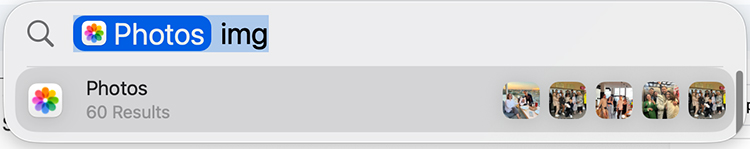
5. Spotlight transformation
macOS Tahoe 26 Spotlight is now jam-packed with features. It has become an advanced Mac search system. So, what are the improvements?
Spotlight has been updated significantly. It can now handle hundreds of actions and has improved search features. You can find files, folders, apps (from Mac and iPhone), messages, and documents from third-party clouds, all organized by how relevant they are. The new filtering options help you focus your searches, and there’s a browse view to explore apps, files, and clipboard history.
Comparisons with Big Sur and Sonoma
The evaluation of Tahoe requires an examination of Apple’s two previous macOS versions.
1. Big Sur (2020)
The 2020 release of Big Sur brought Apple its most significant design transformation since the previous years. The operating system introduced users to fresh design elements through its combination of energetic color schemes and expanded toolbars, and its distinctive iOS design style. Users praised the new design, yet they disagreed about its performance and resource consumption, especially when running on Intel-based computers.
2. Sonoma (2023)
The new operating system design of Sonoma adopted a peaceful design strategy. The interface received minor enhancements through the update, maintaining its original design structure. The system achieved improved performance while delivering refined menu designs and enhanced animation quality. The visual design of Tahoe maintained a close resemblance to Big Sur, so users who had experienced Big Sur would not perceive it as a revolutionary change.
3. Tahoe (2025)
Apple has established a balance point in Tahoe between its design elements. The interface design of Tahoe presents a fresh appearance through its combination of depth effects, smooth edges, and adjustable transparency, while maintaining a subtler appearance than Big Sur. The system provides enhanced functionality through window snapping and improved Mission Control and accessibility features, which create a more streamlined user experience. The performance of Tahoe 2026 runs smoothly because it operates on Apple silicon technology, which provides better performance than Big Sur did.
The new operating system, Tahoe, presents a design that combines modern appearance with operational efficiency to create an optimal user experience.
Psychological Impact of macOS Tahoe Liquid Glass
The Liquid Glass redesign in Tahoe 2026 represents more than visual enhancements because macOS updates have always delivered fundamental changes to the operating system. Apple designed its desktop to look more open and lightweight by using soft window edges, translucent effects, and subtle depth features. This design helps create a workspace that feels less cluttered and more comfortable to look at, which can reduce eye strain during long periods of screen use.
People see visual design differently, and it can create specific feelings that lead to unique reactions. Users experience different emotional responses to Liquid Glass because some find its shimmer and transparency energizing, but others view it as unnecessary visual noise. The main purpose of Liquid Glass goes beyond visual appeal because it aims to transform daily Mac usage by creating a more fluid and accessible interface that promotes calmness.
Potential Downsides & User Concerns
The major design transformation in Tahoe requires users to sacrifice certain features:
- The design elements that create transparency between elements might create visual noise, which affects readability for particular users.
- The visual processing of Apple silicon operates efficiently, but older Macs will experience increased system pressure.
- Users who used the previous design language will need to spend time adjusting to the new interface.
- The accessibility features of macOS provide effective reduction options, but these settings do not meet the requirements of every user.
The company implemented customization options to handle design issues, but previous updates demonstrate that user acceptance depends on their speed to learn the new visual language.
Conclusion
The introduction of Liquid Glass in macOS Tahoe 26 serves a purpose beyond visual enhancement of the Mac interface. The new design serves as Apple’s attempt to develop an interface that provides users with a more natural and user-friendly experience for everyday tasks.